
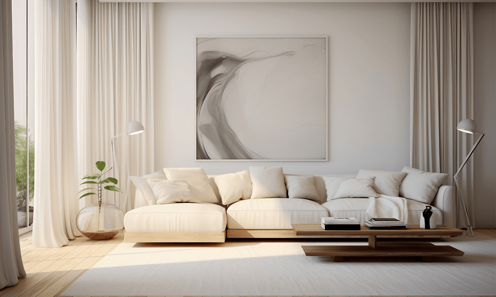
We spend about one-third of our lives asleep—or at least, we try to. In a world that feels increasingly loud and high-definition, your bedroom shouldn’t just be a place where you keep your clothes; it should be a cognitive “reset” button.
Color psychology suggests that our brains process different wavelengths of light in ways that can either spike our cortisol or trigger the production of melatonin. If you’re staring at neon white or aggressive red walls while trying to wind down, you’re essentially asking your nervous system to party when it should be praying for rest.
1. The Heavy Hitters: Colors That Lower Your Heart Rate
If anxiety is a fire, these colors are the cool rain. They have been scientifically linked to lower blood pressure and slower respiration rates.
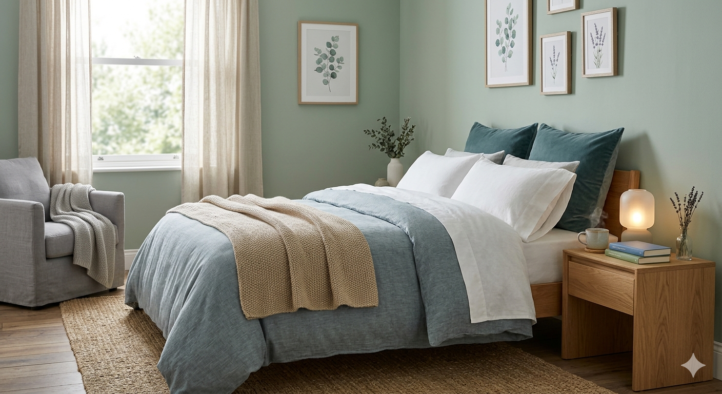
- Soft Sage & Muted Greens: Green is the most restful color for the human eye. Because it sits in the center of the color spectrum, it requires very little adjustment to see. It evokes “biophilia”—our innate connection to nature—which naturally lowers stress.
- Dusty Blues & Soft Navies: Blue is the universal color of peace. Studies consistently show that people in blue rooms sleep longer (averaging 7 hours and 52 minutes) because the ganglion cells in our retinas are most sensitive to blue, which signals the brain to calm down.
- Cool Grays & Pewters: Unlike “stark” gray which can feel clinical, a warm, stony gray provides a sense of security and solidness. It’s the visual equivalent of a weighted blanket.
2. The “Hidden” Relaxers: Warm Neutrals
Not everyone wants to live in a blue box. If you prefer warmth, look for colors that mimic the “golden hour” of a sunset.
- Pale Terracotta or Sand: These earthy tones provide a grounded, “womb-like” feeling of safety without being overstimulating.
- Lavender & Lilac: Purple is often too “regal” or energetic, but a muted lavender has a silver undertone that behaves much like a blue, offering a dreamy, ethereal vibe.
- Warm Off-Whites: Avoid “Brilliant White,” which reflects too much light and can feel harsh. Opt for creamy whites with a hint of yellow or beige to make the room feel soft and lived-in.
3. The “No-Fly” Zone: Colors to Avoid
If your goal is to reduce anxiety, stay far away from these high-energy hues:
| Color | The Psychological Effect | Why it Fails for Sleep |
| Bright Red | Increases adrenaline and heart rate. | Triggers the “fight or flight” response. |
| Vibrant Yellow | High cognitive stimulation. | Keeps the brain “on” and searching for tasks. |
| Deep Purple | Enhances creativity and vivid dreaming. | Can lead to restless sleep or “busy” dreams. |
| Neon/Saturation | Overwhelms the sensory system. | Prevents the eyes from relaxing into darkness. |
4. Pro-Tips for Maximum Serenity
Choosing the pigment is only half the battle. To truly optimize your space for mental health, keep these final tips in mind:
- Mind the Finish: Always choose matte or eggshell. Glossy finishes reflect light, creating “hot spots” that can be distracting and irritating to an anxious mind.
- The “60-30-10” Rule: Use your calming color for 60% of the room (walls), a secondary neutral for 30% (bedding/rugs), and a soft accent for the final 10%.
- Test the Light: Colors change drastically between 10:00 AM and 10:00 PM. Paint a large swatch and watch how it looks under your bedside lamp—that’s the version you’ll be seeing when you’re trying to fall asleep.
The Bottom Line
Your bedroom is the final frontier of your daily mental health. By leaning into low-saturation, cool-toned palettes, you aren’t just decorating; you’re engineering a better night’s sleep.
Are you leaning more towards a “nature-inspired” green or a “cloud-like” blue for your space?